18 Jun
Let’s discover Visual Knowledge Management!
But what is Visual Knowledge Management? There is an incredible amount of knowledge, skills, know-how and processes in a company. The knowledge of your employees, your customers, your suppliers is the most valuable asset your company can have! But how do you encourage your employees to share their knowledge and how do you make this knowledge quickly and easily accessible to all?
All the more so as today there is no lack of information in companies, on the contrary! Too many emails, too many calls, too many text messages, too many chats… In short, you get lost in it!
So, how do we make this knowledge sharing effective?
At Cocoom, we found the solution: Visual Knowledge Management!
Knowledge management, quésaco?
Knowledge management, also known as knowledge management or knowledge sharing, is the use of different tools, methods and organisational modes to facilitate the preservation – and especially the sharing – of all the knowledge present in the company. The knowledge of the various stakeholders in your company is a major competitive advantage and deserves to be retained and, above all, shared with all employees!
Simply put, knowledge management allows each employee to benefit from the knowledge, skills and processes of others, so you don’t reinvent the wheel every time, but establish clear and simple processes so that everyone can learn from each other. You are quicker and more efficient in your decision making thanks to the feedback from your employees, so you avoid wasting time and reproducing mistakes already made. You can also take advantage of some rare expertise that only some of your employees have.
👉 Everything there is to know about sharing knowledge !
Well, what’s the big deal?
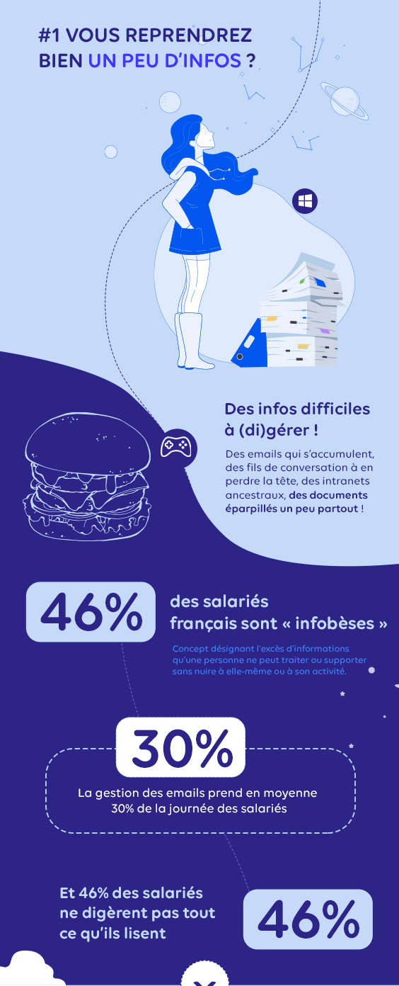
Well, the problem is that we already have tons and tons of information in the company and sometimes it gets a bit complicated! This is called infobesity (or informational overload), emails that accumulate, conversation threads to lose your head, ancestral intranets, documents scattered everywhere… According to a study conducted by OnePoll for the company Mindjet, 46% of French employees are “infobese”, and therefore unable to (di)manage the information they receive throughout the day!
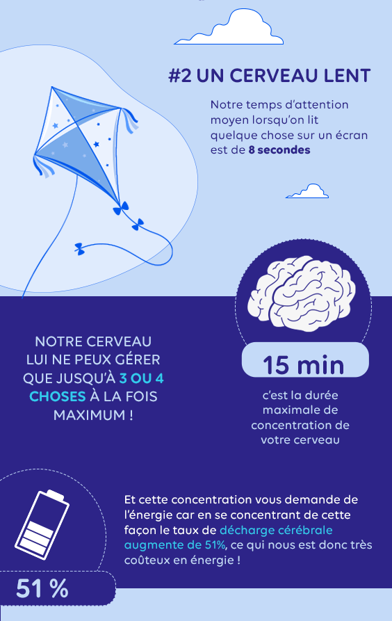
The problem is that our brain does not follow this hyper-rich diet! Neuroscience has proven that the average attention span when reading something on a screen is 8 seconds, less than the attention span of a goldfish. And yes, Bubble is therefore more focused than you are when you’re on your smartphone! Neuroscience has also proven that maximum attention in general lasts only 15 minutes and that during this period, the brain discharge rate increases by 51%, which is therefore very costly in terms of energy.
In short, it’s as much about getting as much information through in record time as possible if you don’t want to put your entire audience to sleep. And that’s what’s complicated!
Our solution, visual knowledge management!
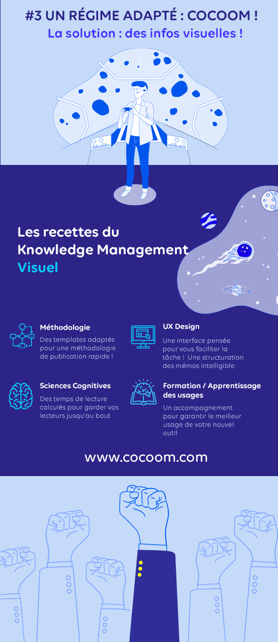
At Cocoom, we believe that knowledge should be easy to share, sort, find, comment and adjust! But above all, they must be easy to read!
For this, they must be visual! But then how do we do it? Abracadabra? Euuuh no it’s not magic… The secret lies in several points!
Easy to read information!
The Cocoom editor, helps each of your employees to share only the essential, to synthesize their information, to make it very visual and to encourage feedback from their colleagues! So the information is very visual and your brain stays with you, all the way to the end!
Knowledge that is easy to find!
Your Cocoom memos are sorted by threads and tags, and the search bar allows you to easily find the information you’re looking for! Your company’s knowledge and processes are therefore all in one place and easy to find!
Processes that adjust little by little!
Feedback from the field will enable you to adjust your processes, knowledge and know-how will be compared with field experience and will therefore be adjusted and refined as you go along.
“But how do they do it?”
It’s a sweet mix of UX, methodological structuring work done to create the memo templates, and the pretty colors of your custom platform that make sharing knowledge visual and your brain stays with you throughout your reading!
But what’s UX?
UX design means User Experience Design, if you translate that into English it’s User Experience Design (yes, it’s always less classy in English). To put it simply, it’s the quality of the experience, the quality of the user’s experience, whether in a digital environment (when you’re on Cocoom, for example) or a physical environment (when you’re in your favorite coffee chain, and you get a free shot of the new Hybiscus Flower Super Chaï Latte).
UX design is often confused with UI design because the two concepts are similar, even if they are, in fact, rather complementary. The UI design corresponds to the design of the user interface, i.e. the general design, colours, layout, shapes, visuals, movements, etc. While UX design is not only focused on design but the priority is the user experience!
On Cocoom the UX design translates into the fact that it is easy and pleasant to edit text, to find information while the UI design translates into the fact that the tool is customized to your colors and very pure.
What about the methodological work?
Here again, we want to simplify the task for you so that you can share your knowledge very easily and very quickly with all your employees. And for this we have designed templates adapted to your business verticals. Let’s just imagine that you use Cocoom for your HR communication and you have to create a whole set of documents to welcome your new recruits, you will find on Cocoom templates already pre-filled, that you will only have to adapt to your company! Your information will therefore be concise, pleasant and easy to read and you will not waste any time!
Now you know all about Visual Knowledge Management!
And to find the entire computer graphics is this way !
